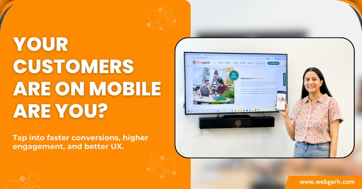
Master the Mobile-First Revolution: Elevate Your Ecommerce Engagement Instantly
Is your ecommerce store truly ready for the mobile-first era—or are you just keeping up?
With mobile devices driving over 60% of ecommerce traffic, businesses that fail to prioritize mobile-first design are missing out on serious growth opportunities.
In this week’s edition of our ongoing series on Ecommerce Trends & Strategies, we’re diving into the mobile-first shift—what it means, why it matters, and how it can dramatically boost your customer engagement. Last week, we explored how AI personalization is transforming ecommerce experiences. Today, we continue that momentum by breaking down one of the most impactful changes in user behavior: mobile commerce.
Keep reading—because mobile-first isn’t just a trend. It’s your new ecommerce baseline.
Understanding the Mobile-First Approach
“Mobile-First” isn’t just a buzzword—it’s a design and development philosophy built around today’s real user behavior.
Instead of creating a desktop site and adapting it for smaller screens later, a mobile-first strategy starts with the smallest device and scales upward. That means faster performance, simplified navigation, and seamless interactions—exactly what mobile shoppers expect.
What Does “Mobile-First” Really Mean?
At its core, mobile-first development is about:
- Designing for smartphones and tablets before desktops
- Prioritizing touch-friendly UI elements
- Ensuring content loads quickly and adapts responsively
- Creating intuitive, tap-based interactions
We help ecommerce brands build from this foundation, ensuring every mobile user gets an experience that feels fast, familiar, and frictionless.
Mobile-First vs Mobile-Friendly: Key Differences
- A mobile-friendly website is designed to function on smartphones, but it often feels like a downsized version of a desktop site.
- In contrast, a mobile-first approach starts with mobile at its core—designed specifically for smaller screens and then scaled up for larger ones.
A mobile-friendly site might “fit” on a screen, but a mobile-first site performs on it.
In e-commerce, performance is everything—from loading speed to checkout flow.
Mobile User Behavior and Ecommerce Trends
The mobile-first shift is not just a design trend—it’s driven by real changes in user behavior. Ecommerce businesses can no longer afford to ignore the growing dominance of mobile shopping.
Stats That Prove Mobile is Dominating
- Over 50-60% of global ecommerce sales now come from mobile devices
- Mobile users are 3x more likely to make impulse purchases compared to desktop users
- 40% of mobile users abandon a website that takes more than 3 seconds to load
These numbers highlight one simple truth: Mobile is no longer secondary—it’s primary.
Changing Consumer Habits and Expectations
With smartphones in hand, consumers expect a seamless shopping experience at any moment. The mobile-first shift isn’t just about responsive design—it’s about delivering an instant, easy, and personalized shopping journey.
What this means for ecommerce businesses:
- Users expect fast load times and instant access to product information.
- Easy checkout is a must. A complicated, long-form checkout on mobile can lead to high cart abandonment rates.
- Mobile-first users demand intuitive, touch-friendly navigation, from the homepage to the cart.
To keep pace, your ecommerce store must embrace mobile-first strategies to meet these evolving demands and drive higher conversion rates.
Key Benefits of Adopting a Mobile-First Strategy
The mobile-first approach isn’t just about keeping up with trends—it’s about unlocking powerful advantages that drive engagement, increase conversions, and improve visibility.
1. Enhanced User Experience
In a mobile-first world, user experience (UX) takes center stage. A streamlined, responsive design ensures that mobile users get the best possible experience, whether they’re browsing products, reading reviews, or completing a purchase.
By adopting a mobile-first strategy, your site will:
- Load faster on mobile devices
- Offer touch-friendly navigation
- Minimize scrolling and clutter
2. Higher Engagement & Conversion Rates
Mobile-first design strategy doesn’t just attract users—it keeps them engaged. Mobile-friendly sites encourage:
- Shorter decision-making times due to easy access to product details
- Streamlined checkout processes that drive higher conversion rates
Mobile-first website design delivers higher conversion rates by prioritizing seamless user experiences on mobile devices.
3. Improved SEO and Visibility
Search engines like Google prioritize mobile-first sites in their rankings. A mobile-optimized site not only improves user experience but also boosts SEO rankings, leading to:
- Increased organic traffic
- Higher visibility in search results
How to Make the Mobile-First Shift
Shifting to a mobile-first strategy isn’t just about redesigning your site—it’s about rethinking your entire ecommerce experience. Below are key steps to help you implement a successful mobile-first approach:
Optimize Mobile UX/UI Design
Designing with mobile users in mind means:
- Simplifying layouts to prioritize essential content
- Ensuring touch-friendly buttons and menus for easy navigation
- Using larger fonts for better readability
Designing with a mobile-first mindset means your ecommerce site feels natural, intuitive, and easy to use on smaller screens.
Prioritize Speed and Performance
Mobile shoppers have little patience—fast-loading pages are essential to keep them engaged and drive conversions.
- Compress and streamline images and assets to improve load speed and boost overall mobile performance.
- Minimizing heavy scripts to improve performance on mobile networks
- Using caching and content delivery networks (CDNs) for speed
Simplify Navigation and Checkout
Complexity is the enemy of conversions. Ensure your site’s mobile navigation is:
- Easy to understand with clear calls to action
- Streamlined checkout with minimal steps to increase mobile purchases
Use Mobile-Optimized Content and Media
Adapt your content for mobile:
- Ensure images are responsive
- Use video content that loads quickly without sacrificing quality
Tools and Technologies That Support Mobile-First Ecommerce
Adopting a mobile-first strategy isn’t just about design—it’s also about using the right technologies that make the experience fast, seamless, and scalable. These tools help ecommerce businesses build responsive, high-performing websites that meet mobile users’ expectations.
Mobile-Responsive Themes and Frameworks
- Use frameworks like Bootstrap or Tailwind CSS to create flexible layouts
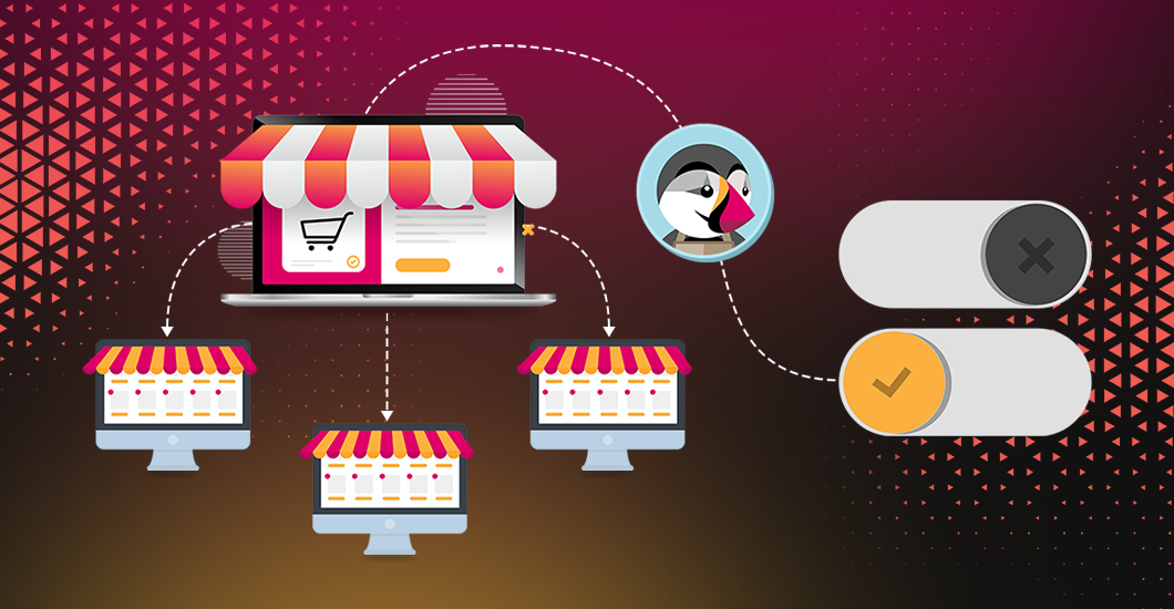
- Choose mobile-first themes designed specifically for ecommerce platforms like Shopify or WooCommerce
Progressive Web Apps (PWAs)
- It blends the capabilities of native applications with the accessibility and broad reach of the web.
- They enable offline access, fast loading, and app-like experiences without requiring a download
AMP (Accelerated Mobile Pages)
- AMP helps deliver content almost instantly on mobile
- Ideal for product pages, blogs, and landing pages where speed directly impacts engagement
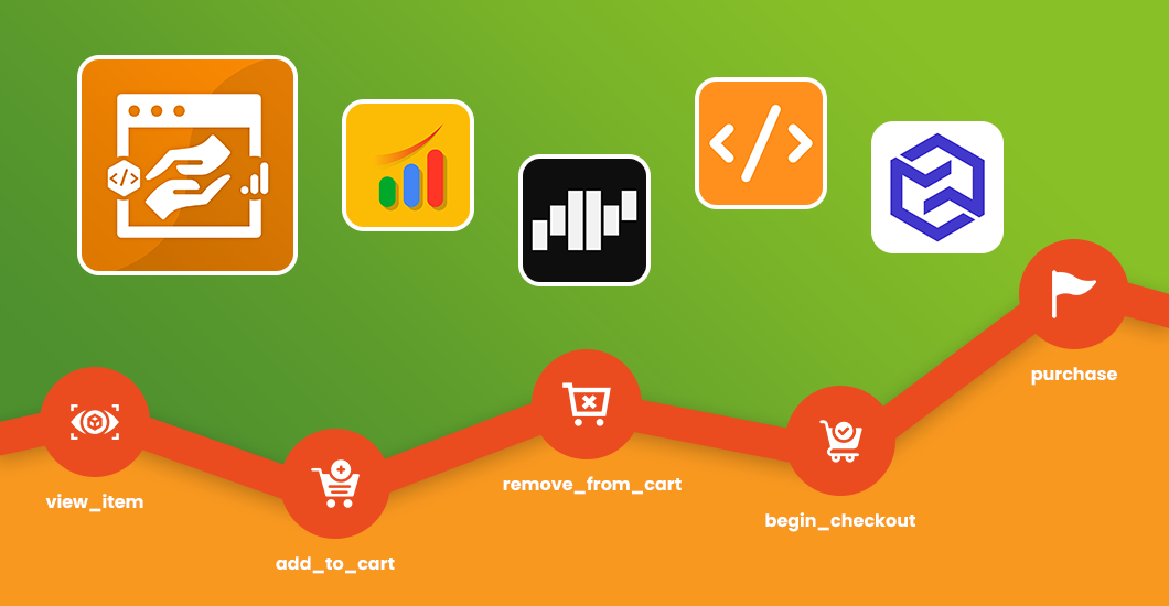
Analytics Tools for Mobile Metrics – h3
- Tools like Google Analytics 4, Hotjar, and Mixpanel offer insights into mobile behavior
- Track metrics like tap patterns, scroll depth, and mobile conversion funnels
As a development partner, we help ecommerce brands integrate these technologies with precision, building mobile-first ecosystems that perform at every touchpoint.
Future of Mobile-First in Ecommerce
The future of mobile-first ecommerce is set to be shaped by emerging technologies that further enhance user experiences and drive innovation. As mobile usage continues to dominate, businesses that stay ahead of the curve will reap the rewards.
AI, AR, and Voice Search on Mobile
- Artificial Intelligence (AI) is enabling hyper-personalized shopping experiences on mobile devices, allowing businesses to recommend products based on real-time behavior.
- Augmented Reality (AR) will revolutionize mobile shopping by providing virtual try-ons and immersive product experiences, making customers feel more confident in their purchases.
- Voice search is gaining traction, with users increasingly using voice commands to search for products on mobile devices, meaning businesses must optimize for voice queries to stay relevant.
The Evolving Mobile Shopping Experience
- Mobile experiences are becoming smarter and more intuitive, with predictive search, instant purchase options, and one-click payments becoming the norm.
- With the rise of 5G, mobile websites and apps will load faster than ever, delivering ultra-low latency for seamless interactions.
To stay competitive, ecommerce businesses must embrace these advancements and ensure that their mobile-first strategies are future-proof, leveraging the latest technologies to create engaging, high-converting mobile experiences.
Conclusion: Take Action—Embrace Mobile-First Today
The shift to mobile-first is no longer optional—it’s essential. From user expectations to Google’s indexing priorities, everything points toward one undeniable truth: your ecommerce growth depends on how well your business performs on mobile. By adopting a mobile-first approach, you don’t just improve usability—you unlock better engagement, higher conversions, and long-term customer loyalty.
At WebGarh Solutions, we help ecommerce brands make this shift with precision—from crafting seamless mobile UX to implementing advanced technologies like PWAs, AMP, and mobile-optimized checkouts.
If you’re ready to build a mobile-first ecommerce experience that performs and converts, let’s talk.
Explore our development solutions and take your ecommerce strategy to the next level.